I appreciate your work, but frankly I have a big problem with your diagrams and their representations.
Similar to your previous post of "Symmetry and Hierarchy", the posted diagrams are very inconsistent graphically and looks like you have not spent enough time in organizing your information. For someone who is not familiar with your studies and looking at your postings, for example, it will be hard to understand where these images are situated in relations to your plan.
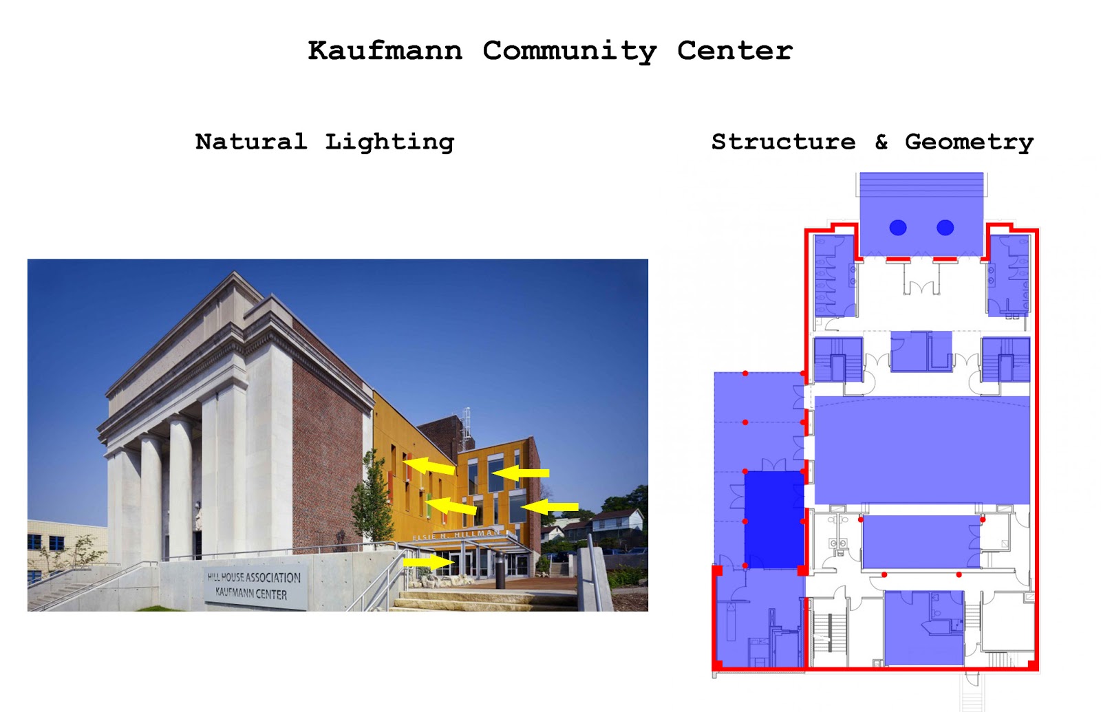
But then, I realize that you used the images purely to analyze lighting conditions, and plans are only focusing at structural issues. I was fine for a while, until I saw you changing the format at Gleneagles, analyzing your structure on image (rather than on plan).
First, it will be better if you organize your lighting, structural, and geometry/symmetry study separately. Having them in one sheet is confusing for us to grasp your thoughts.
Then, stick with a particular format of representation for every case study. Image analysis is nice touch, but it have its limitation in understanding how lighting and structure works. Use your "plans", and especially "sections" with these studies as this is our way of communicating our ideas.
Perhaps, couple of images max. and show a plan and section analysis that best represent the function of your building.
I used the image for structure in the Gleneagles case due to the lack of a clear structural plan but I have recently found a floor plan which details the structure more clearly and I will update the Gleneagles sheet. As for separating the studies, they will be separated in a final case study posting which summarizes all the research done on each Community Center. I will put all my effort on making the summary sheets as clear and consistent as possible. Thank you.
Hi Heriberto, I think that the structural representation is good except that graphically you could make it more pronounced - bolder lines perhaps and fading the other elements - I notice that you are only analysing the structure in plan not in section? Is there a reason for that? Regarding the light elements - it would be useful to show a sunpath on plan, plus the fact that sun appears at different angles at different times of the year so that for example, the schemes with heavy canopies will work differently - I wonder if you could reflect this in your diagrams? To me, maximising natural daylight is one of the most important factors of design. I realise though that in Yorkshire, England, we have a different climate!
I totally agree that you should work more on your presentation. I was also confused about this post, mostly about the colors. I don`t see why are they the same in the plans and on the photos? If you want to emphasize the volumes and different parts maybe you should fade the floor plan or the photos so you can only see the schematized geometry and it`s parts and not focus on the details below. You could do that to the facades as well, dividing the openings from the walls and translating them in positive and negative spaces using only black and white color. I also think that you should separate the structure diagrams from the other ones so you can see all the layers in one building, the structure is one of them.


I appreciate your work, but frankly I have a big problem with your diagrams and their representations.
ReplyDeleteSimilar to your previous post of "Symmetry and Hierarchy", the posted diagrams are very inconsistent graphically and looks like you have not spent enough time in organizing your information. For someone who is not familiar with your studies and looking at your postings, for example, it will be hard to understand where these images are situated in relations to your plan.
But then, I realize that you used the images purely to analyze lighting conditions, and plans are only focusing at structural issues. I was fine for a while, until I saw you changing the format at Gleneagles, analyzing your structure on image (rather than on plan).
First, it will be better if you organize your lighting, structural, and geometry/symmetry study separately. Having them in one sheet is confusing for us to grasp your thoughts.
Then, stick with a particular format of representation for every case study. Image analysis is nice touch, but it have its limitation in understanding how lighting and structure works. Use your "plans", and especially "sections" with these studies as this is our way of communicating our ideas.
Perhaps, couple of images max. and show a plan and section analysis that best represent the function of your building.
I used the image for structure in the Gleneagles case due to the lack of a clear structural plan but I have recently found a floor plan which details the structure more clearly and I will update the Gleneagles sheet. As for separating the studies, they will be separated in a final case study posting which summarizes all the research done on each Community Center. I will put all my effort on making the summary sheets as clear and consistent as possible. Thank you.
DeleteHi Heriberto,
ReplyDeleteI think that the structural representation is good except that graphically you could make it more pronounced - bolder lines perhaps and fading the other elements - I notice that you are only analysing the structure in plan not in section? Is there a reason for that?
Regarding the light elements - it would be useful to show a sunpath on plan, plus the fact that sun appears at different angles at different times of the year so that for example, the schemes with heavy canopies will work differently - I wonder if you could reflect this in your diagrams?
To me, maximising natural daylight is one of the most important factors of design. I realise though that in Yorkshire, England, we have a different climate!
I totally agree that you should work more on your presentation. I was also confused about this post, mostly about the colors. I don`t see why are they the same in the plans and on the photos? If you want to emphasize the volumes and different parts maybe you should fade the floor plan or the photos so you can only see the schematized geometry and it`s parts and not focus on the details below. You could do that to the facades as well, dividing the openings from the walls and translating them in positive and negative spaces using only black and white color. I also think that you should separate the structure diagrams from the other ones so you can see all the layers in one building, the structure is one of them.
ReplyDelete